Evaluation 1: VW |
 |
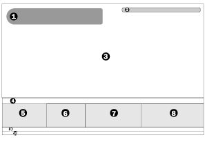 |
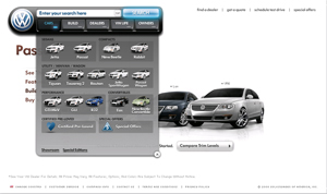
Website Diagram 1) Main Navigation. 2) Secondary Navigation. 3) The Content Area4) Alt Text Links for Car Models 5) lLt text Links 6) Alt Text Links. 7) Ad-like Link 8) Ad-like Link. |
 |
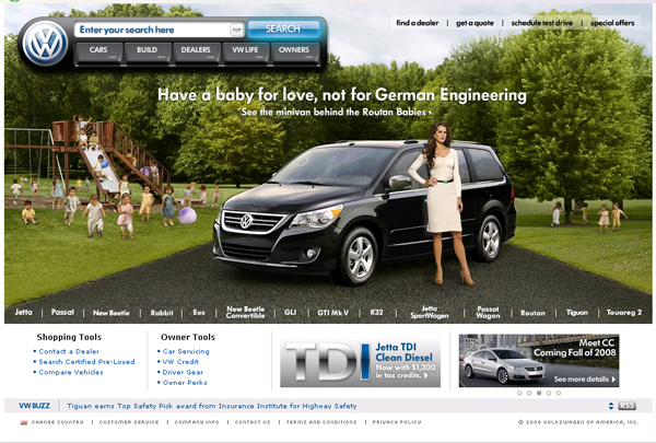
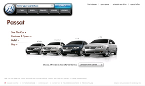
Consist Graphics: The navigation stays the same and remains in the same position through out all of the pages. The Background may change and the foot changes from page to page but that navigation allows the viewers to easily navigate the website and reassures to the viewer that they can easily find what they need again when they re-visit the website. |
 |
Colour:
The website creates a new clean feeling by using the colour white through-out the layout, including in the imagery. Most of the cars displayed in the navigation and background image are white. The Pages stick to white as the primary colour, then blue and black as supporting colours. |
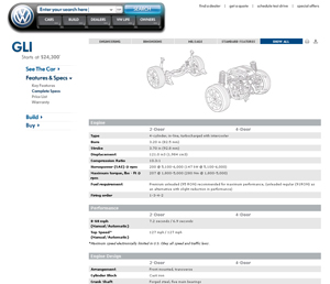 |
Hierarchy: The pages have very strong hierarchy. Your eye starts at the nav/ name container, moves down to the page tittle, and then down to the secondary nav under the page title. |
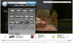 |
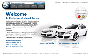
Value: the layout takes advantage of sharp contrast in value. Since many of the pages are white, this black page holds a more important view to it because it is black and the video is playing in the background. |