Evaluation 2: Blindness |
 |
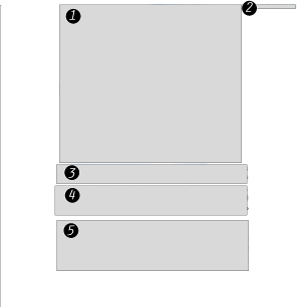 |
Website Diagram
1) Main Graphic 2) Preferance Options. 3) Title 4) Alt Text Links for Car Models 5) Legal Copy |
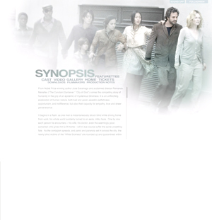 |
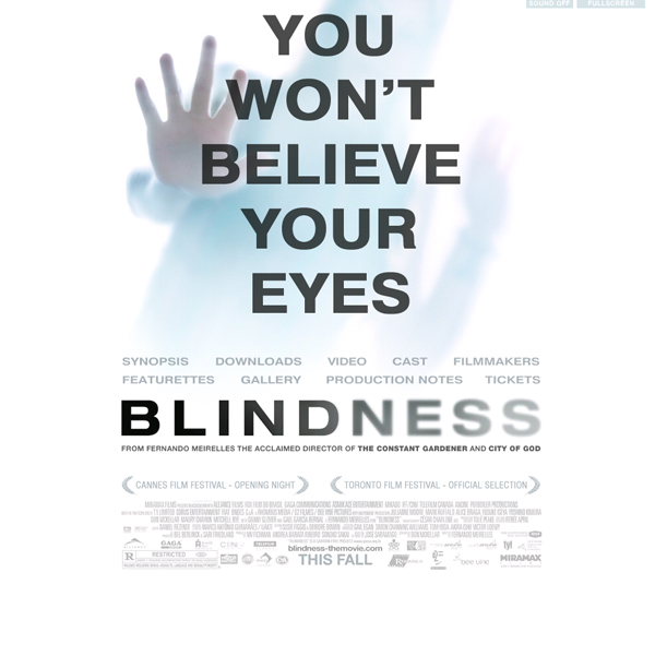
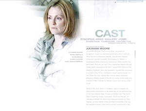
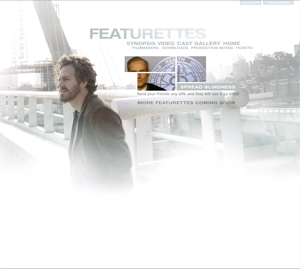
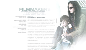
Simplicity:
The flash based website is very simple. It doesn't scream in your face to look here and there. it has a faded back photo. the navigation and the content. The viewer doesnt get confused or distracted away from reading what they want to see. It also has simplicity with its colours. The design is nearly limited to gray scale or very undersaturated imagery. |
 |
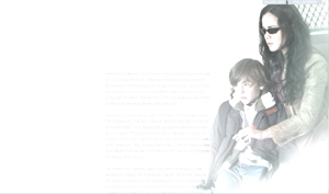
Consistancy $ Variety:
. Even though all of the pages dont look exactlt the same they have consistant elements: a faded photo, nav, and the content. the elements are all presented in the same style but in slightly different positions which allows for the design to break the monotomy. |


 |
Theatrics:
When transistioning between pages there is a small clip from the movie which emulates a newscast. It then goes into the page and slowly fades into focus, as if a blind person was re-gaining thier vision. |
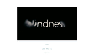 |
Title:
The website adapts the idea of blindess by having the pages come into vision. The designers couldn't exactly have everything fade out because then then the viewers wouldnt have any information to view. |