Evaluation 2: Ponds |
 |
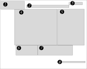 |
Website Diagram
1) Title 2) Main Navigation. 3) Log in Area 4) Photo of Products 5) Support Photo 6 )Link for Contest Info 8) Ponds News |
|
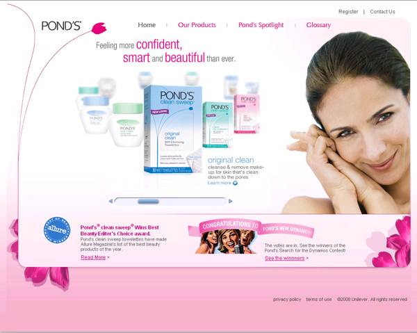
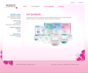
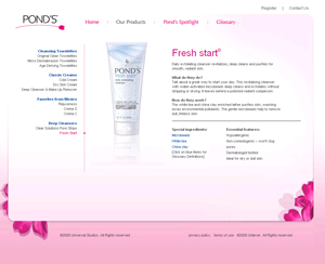
Easy Navigation:
The primary and secondary navigation stays consistant on the interior pages. It is very simple abd clean and follows the feeling that the products should display. |
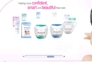 |
Interactivity::
On the home page there is a spinning navigation so you can view the products. It allows you to find the right product you want to know about even if you aren't sure the exact name of it. The flash is only found on this page which allows the majority of the pages to be very small files and easily accessible to people using screen readers or slow internet connections. |
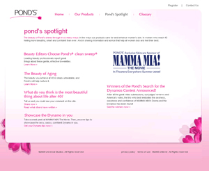 |
Cross Branding:
The website promotes the Movie Mama Mia (and the opening advertisments of the movie promoted Ponds) as the main cross-branding company. It also has links to magazines that have articles in relation to the brand. |
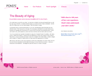 |
Colours:
The colours used in the designed are very feminine, clean, and young, which all hint at what the women who use this product want to be. The pages consistantly use pink, black, and white. Also the pages tend to have pink gradients on them. |