
![]()
Mike Wieringo
What was your concept for this site?
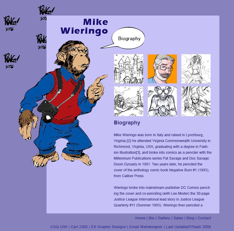
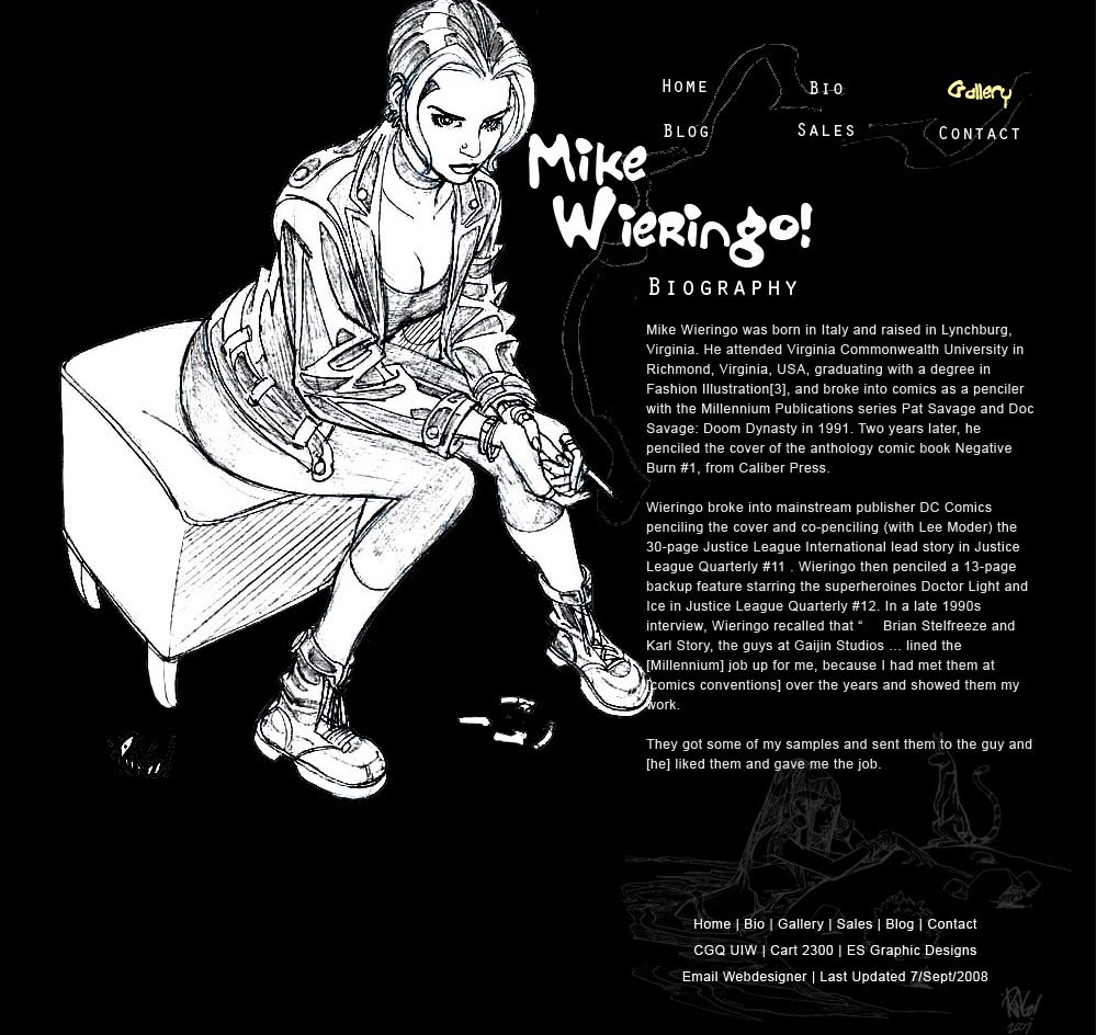
I tried 3 different approaches to this site. The first layout showed a playful appearence to Mike Wieringo. The 2nd layout showed an artistic view of him, kinda like having the sketches be coloured in. The Last site showed a cool, elegant view of his work.
Layout #1 |
Layout #2 |
Layout #3 |
 |
 |
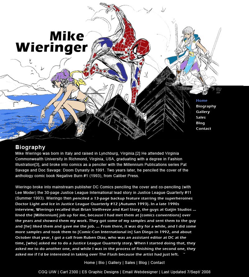 |
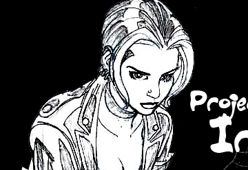
| I thought this layout didnt look as developed as the others and seemed cheesy. | I liked the elegance oiof this layout and its nice hierarchy. | I liked the strong contrasts in this layout. |
Which design did you choose and why?
I chose the 2nd layout i made with the close up of a woman in Mike's sketches. I liked the strong hierchy of the layout and the simplicity of it. I almost chose the collauge of sketches but i think for that one to work i might have to re-paint the drawings a bit better.
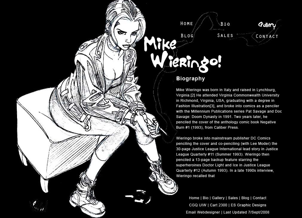
What changes did you make to your revision and why?
I tried adding in colour to the layout but i think it seemed to forced and confusing. Instead im going to let the colours of the thumbnails be what brings colour into the design. I also added in a designed footer.